


Maps in Election Forensics
Election transparency has been in slow retreat for more than a century.
As election systems have became more automated, transparency has
diminished to the point where it has become little more than poll
watching plus some spot-checking of election statistics.
Although journalists and researchers try to push deeper into those statistics, their targets are limited in depth.
In Chicago, for instance, wards are generally the smallest targets of interest.
As we'll see, units this large invariably miss much of interest.
Fortunately, technology is now turning the tide.
Fifty years ago, computers were room-filling behemoths; now they're wallet-sized.
Software used to cost thousands of dollars; now there's an endless supply of even free software.
Before, only experts knew how to operate computers; now even school children can compile and digest reams of data.
More and more, technology is coming into the hands of average citizens--and into supporting their role as citizens.
One of the most empowering tools in recent years is a software package
from the Geospatial Software Lab at Idaho State University.
MapWindow is a geographic information system (GIS)--a program for creating maps.
Commercial GIS packages cost many thousands of dollars, but MapWindow is available free of charge.
MapWindow offers a new way to boost the transparency of elections.
It allows even low-budget civic groups to create detailed maps of an election.
How do detailed maps help?
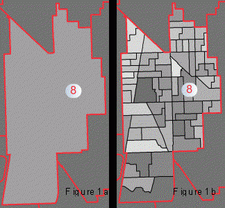
The first map shows the turnout percentage for the 8th ward as a whole. The second shows the percentage for each precinct.
 The differences become even more curious when we compare this ward to the nearby 17th Ward (Figure 2).
The turnout there was nearly homogeneous.
The differences become even more curious when we compare this ward to the nearby 17th Ward (Figure 2).
The turnout there was nearly homogeneous.
Observations like these may well have a reasonable explanation.
But others are definitely troubling--for instance, problems with precinct report envelopes.
The election judges in each precinct are to use a special envelope to return the precinct's reports, including the precinct's computerized vote-tally tape.
The map below (Figure 3) shows which precincts in the above wards failed to meet envelope security requirements.

The map clearly identifies the type and number of breaches:
- Orange: Envelopes that did not contain a vote-tally tape.
- Red: Envelopes that were completely empty.
- Blue: Envelopes whose flaps were not sealed.
- Green: Envelopes whose flaps were taped.
But as a map, it reveals even more: The breaches occur in clusters. In addition, there are clusters of specific types of breaches.
Are these clusterings random? Or do their precincts have something in common?
Whatever the answer, patterns like these will likely never be noticed or addressed apart from maps like the above.
Here are some other areas of study in which maps can help detect patterns:
- Poll-judge mistakes.
- Machine malfunctions.
- Voter complaints.
- High or low turnout.
- Voter preferences.
- Neighborhood demarcations.
- Redistricting.
- Allocation of public resources.
MapElection.org comprises three elements:
- A smorgasbord of maps
The maps are high-res "photos" of the election locale. By depicting precincts instead of simply wards, the maps convey information that is up to fifty times more detailed. (Chicago has an average of fifty precincts per ward.)
Each map colorizes the precincts according to a single metric. One map shows the vote count for Candidate A, another shows the count for Candidate B, another map shows the precinct turnout, and so on. Patterns become immediately evident. - A map displayer that animates the differences between maps
Visitors can rapidly flip back and forth between maps, making their color differences "flicker." This reveals deeper patterns and relationships, those that exist between the metrics represented by the maps.
For instance, a candidate might receive a high percentage of the vote, but only in precincts with low turnout. In some circumstances, this might raise suspicions of voter suppression. - A public blog
Visitors are offered space to share questions and comments with other visitors.
We invite you to visit. You'll discover patterns and anomalies on your own after just a few minutes!


