Somewhere in any conservative bag of fundamental beliefs you will probably find the notion that we all pay too much in taxes, that corporations and people with big incomes pay way too much and that taxes just keep going up. Likewise, somewhere in every liberal's bag of beliefs is the confidence that there is too much disparity in incomes and that the wealthy do not pay their fair share of taxes. Neither the conservative nor the liberal is apt to have full confidence in these underlying facts since even those who have looked at the actual numbers must surely have applied some subjective judgments to them.
My purpose in this article is to describe some of the underlying numbers. Mostly I present graphs that I derived from three sources of data. The first database from the White House provides historical data on tax revenues and CPI tables for making inflation adjustments are available from the Bureau of Labor Statistics. The third source of data is the IRS which provided fairly detailed statistical information for 1999 and for 2006 (no later data is available yet).
This article considers income taxes only. This is not because payroll taxes, sales taxes and other government revenue streams are unimportant but primarily because the emphasis in the media and therefore in public discussion is so much on income taxes. A more comprehensive study of taxes would certainly be worth doing, but it is beyond what I can hope to accomplish, at least for now.
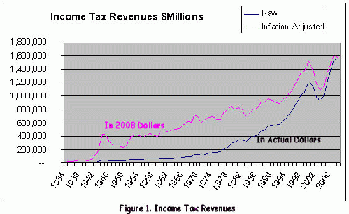
Figure 1 shows the amount of income tax revenues collected by IRS. It is not really surprising that revenues follow an upward trend. At first glance it may seem as though just inflation would account for such a trend, but the inflation adjusted curve is not so different in shape from the graph for unadjusted dollars. In fact, both curves appear to show exponential growth. That too is not surprising when you realize that population growth is exponential.
Republicans often claim that lowering income taxes will result in increased revenues and this was one of the justifications given to lowering income taxes during the years 2001-2006. Figure 1 would seem to refute this claim.
Figure 2 shows the per-capita growth of tax revenues; the term per-capita is a bit mis-used here to mean per-taxpayer where a taxpayer typically is a family unit and not necessarily an individual. Seeing this graph will surely confirm the conservatives fundamental belief that the government is taxing us more and more each year. Surely our conservative friends will point out that even adjusting for inflation, the taxes on individuals go up every year. How can this go on forever? The answer is that the economy is growing and individuals are, on average, earning more and more every year.
Figure 3 shows this clearly by showing the personal income tax as a percent of income. The tax paid by individuals certainly goes up and down, but since the late 1940's, the income tax paid on average by individuals has been about 10%. Clearly Figure 2 shows a linear increase in inflation-adjusted taxes only because the income of individuals is growing, not because the tax rate is increasing. Figure 4 shows that inflation adjusted per-capita income has increased roughly linearly, just as Figure 2 shows that inflation adjusted per-capita income taxes have.
Figure 5 shows the interesting decline in taxes paid by corporations. There appears to be a slight upward trend since 1984 and it is interesting that there was actually a big increase that began around 2005. It would be interesting to break down these numbers according to the size of the corporations, but I do not have any data of this sort. There is likely to be quite different behavior between small S-corporations with low capitalization and the big publicly traded giants. Anecdotally, I have heard that the large corporations often pay no taxes at all, but unfortunately I do not have any supporting data.
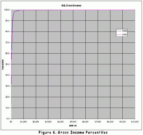
Turning now to the 1999 and 2006 data from the IRS, Figure 6 shows the percentile for a given level of income. Few charts can better illustrate the disparity of incomes in our country. Reading some data points from the curves, an income of $242,000 would put a taxpayer at the 98.1% level, meaning that 98.1% of tax payers made less than $242,000. In 2006, an income of $242,000 put one only at the 97 percentile level.
It should be noted in this chart and in the remaining charts to be presented below, the horizontal axis represents 2006-inflation adjusted dollars. That is to say, 1999 dollars are adjusted by a factor of 1.212 to compensate for inflation.
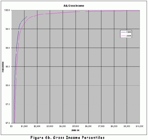
Figure 6a and Figure 6b show portions of Figure 6 to make the finer details easier to read. Reading Figure 6a, you can see that in 1999 an income of about $32,000 (inflation adjusted to 2006 dollars) would put you in the 50 percentile area whereas in 2007 this required an income of closer to $37,000. This horizontal axis represents reported gross income.
It is interesting that between 1999 and 2006 the distribution of incomes had changed enough that the IRS changed its reporting data. In 1999, the IRS provided no detail about incomes over $1 million, lumping all 205,124 of them together. This is why the 1999 curve ends at an inflation-adjusted $1 million. However in 2006 they showed 354,193 returns with over $1 million gross ($824,814 in 1999 dollars). In fact, 203,661 returns in 2006 showed more than $1.5 Million and 15,956 had incomes over $10 million ($8.2 million in 1999 dollars).
Figure 7 shows the tax rate for various income levels. It should be emphasized that this is not the marginal rate, but rather the percent of income that, on average, people of a particular income pay in income taxes. One thing to notice is that there was indeed a dramatic drop in taxes rates between 1999 and 2006, but the reduction was greater at higher incomes. For example, a taxpayer making $60,000 in inflation adjusted dollars would have paid about 23.5% of his income in 1999 but only 19.9% in 2006; this a reduction by 3.6%. However, a taxpayer making $400,000 would have paid about 30.9% in 1999 but only about 25.9 in 2006; this is a reduction by 5%.
It is a popular belief that rich people do not pay taxes, that their clever tax consultants let them get away without paying. The chart shows that this is not the case and that people with incomes well into the millions are paying income taxes at a rate somewhat higher than those with incomes below $100,000. However, those tax consultants must be doing something right. As incomes go above about $600,000 the actual tax rate paid does gradually drop and it appears to drop a bit faster in 2006 than it did in 1999.
Figure 7a is provided to make the chart in Figure 7 easier to read for incomes below $50,000.
Figure 8 shows where the money is that can be taxed. For example, in 2006 about 15% of the taxable income in the United States was in the hands of taxpayers making at least $2 million in gross income. If the axis were extended out further, you would see that 15,956 taxpayers with gross incomes over $10 million receive about 7.3% of the taxable income of the country. At the other extreme, the 80 million taxpayers making less than $40,000 also receive about 7% of the taxable income of the country.
Figure 8a shows better detail than Figure 8 for the incomes of nearly all taxpayers.
Figure 9 shows where the government collects personal income taxes and Figure 9a shows more clearly how it is collected from most taxpayers.
It is of some interest to follow the median taxpayer through the graphs based on IRS data. You may recall that Figure 6a shows that median taxpayer to have had a gross income of $32,000 in 1999 and of $37,000 in 2006. Figure 7a shows that taxpayer to have paid 22.1% of his income in income taxes in 1999 but only 19% in 2006. Figure 8a shows that all people having incomes at or below that of this median income earn about 7% of all of the country's income and Figure 9a shows this group to pay about 7% of the income taxes.
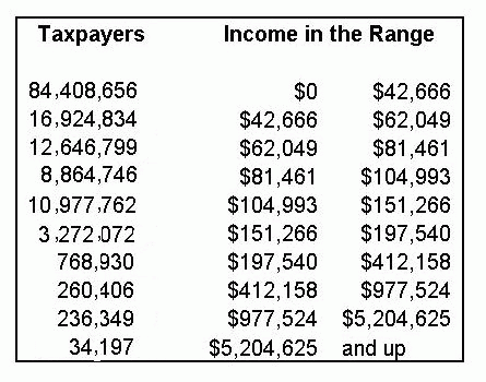
As a final thought, I made some estimates of the income ranges for ten blocks of taxpayers with each block having the same amount of taxible income. The numbers in the table are approximate, determined by linear interpolation of the 2006 IRS data.


